Today we’re going to play around with real-time data transfers using PubNub and animated charts using D3.js. We’ll use these tools to build an interactive bar chart which reacts to data sent from a different browser window.
When we’re done you should have something which looks like this:
First things first. Let’s get to know our tools.
PubNub is both a company and a product. They have a network dedicated to scalable real-time communications and provide API’s for a multitude of programming languages, to make it easy to harness the power of their infrastructure. Today we are going to be using their Javascript API to handle our data transfers.
As a side-note. At AgilityFeat we love PubNub. We love it so much that they wrote about a product we built for a client of ours which relies heavily on their Javascript API. Be sure to check it out after finishing up with this post.
D3.js or D3 for short, is a Javascript data visualization library with a ridiculous amount of readily-available charts, and a built-in engine which allows to create any kind of data graph you can think of.
Just take a look at the examples gallery on their website, it’s massive!
D3 relies heavily on CSS3 and HTML5, especially on transitions as well as the canvas tag (which is where most of the magic happens).
What you’ll need
- Git
- A text editor
Elements we are going to build
- A “client” containing a bar chart which will recieve data through PubNub and react accordingly.
- A “server” app which will publish data through PubNub to a channel which the client will be subscribed to.
Just as I did with the last post, I’m going to provide you with a repo on github which has a working example of what we are building here.
Be sure to download the repo using git:
https://github.com/agilityfeat/PubNub-Chart-Demo
In order to use it, you’ll need to head on over to PubNub’s website and sign up to get your own Publish Key and Subscribe Key.
I won’t to go into detail about the signup process and getting the keys since it is as easy as logging in once you have an account and copying and pasting:
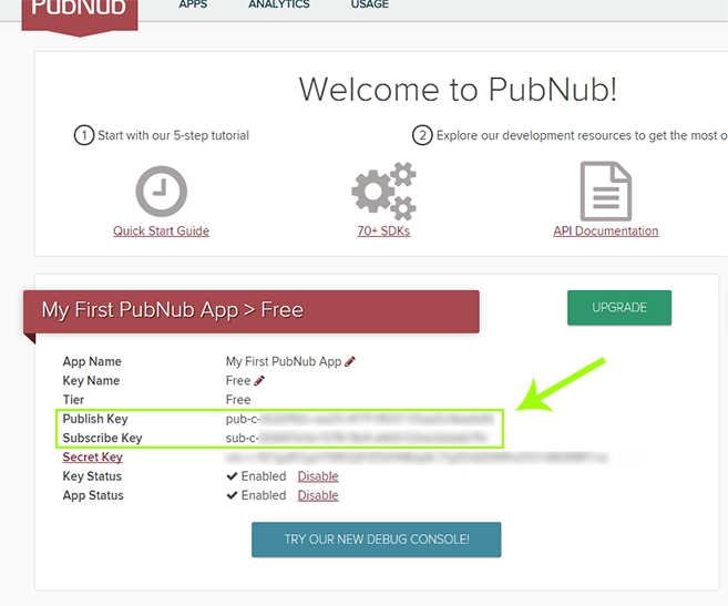
Once you have the keys, add them to the client.pubnub.js and server.pubnub.js files. If you get lost, follow the tutorial ’til the end and you should get a better clue of where everything goes.
Now to stir things up a little I added some sugar to the example by using Semantic UI to make the server look a little more pleasing to the eye. The code I’ll be showing here is the bare-bones version of the app. This way you have a point of reference when looking at ways to implement this sort of code within a template.
Alright, let’s get started.
Client: HTML and CSS base
We’ll begin by creating the chart so that when we move on to the actual sending of data with PubNub, we have a way to verify the arrival of said data.
Let’s begin by setting up the HTML for our client app:
<!DOCTYPE html>
<html>
<head>
  <meta charset="utf-8">
  <title>Client</title>
  <link rel="stylesheet" href="css/chart.css">
  <script src="lib/d3.min.js"></script>
  <script src="lib/pubnub-3.7.13.min.js"></script>
</head>
<body>
  <script src="js/client.chart.js"></script>
  <script src="js/client.pubnub.js"></script>
</body>
</html>
This is as far as the HTML goes. We won’t be doing anything else to it since D3 generates all visuals from the javascript we feed it.
Now, note we are loading up D3 and PubNub by referencing the libraries locally:
<script src="lib/d3.min.js"></script>
<script src="lib/pubnub-3.7.13.min.js"></script>
You can download the minified javascript files from their publicly available CDN’s at:
- https://cdnjs.cloudflare.com/ajax/libs/d3/3.5.5/d3.min.js
- http://cdn.pubnub.com/pubnub-3.7.13.min.js
Aside from D3 and PubNub we are creating a CSS named “chart.css” to hold the colors and overall styling of the bar chart:
<link rel="stylesheet" href="css/chart.css">the contents of the CSS file:
/* Color of the bars */
.bar {
  fill: #4682B4;
}

/* Color of the bars when mouse is over them */
.bar:hover {
  fill: #7fc71d;
}

/* Font of the axis labels */
.axis {
  font: 10px sans-serif;
}

/* Style of the axis lines */
.axis path,
.axis line {
  fill: none;
  stroke: #000;
  shape-rendering: crispEdges;
}

/* Just for illustrative purposes */
/* we will hide the line of the x axis */
.x.axis path {
  display: none;
}
and two javascript files, client.chart.js to build the chart using D3 and client.pubnub.js to handle our communications through PubNub:
<script src="js/client.chart.js"></script>
<script src="js/client.pubnub.js"></script>
Building a bar chart using D3
Let’s take a closer look at the chart we want to generate:
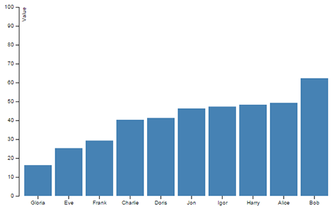
It might not seem like the most complex of charts at a glance, and in fact it isn’t, but it does have its nuances. The first one being the axes, or rather, the difference in value types they contain.
Let me illustrate what I mean:
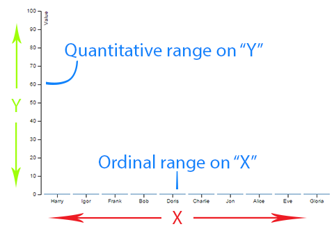
Our ‘Y’ axis contains numbers, a range of numbers from 0 to 100 to be precise. This means that the values on the ‘Y’ axis can easily be subjected to math operations, they represent quantities rather than entities.
On the other hand, on our ‘X’ axis, we have a range of names, 10 names representing 10 subjects or entities which have been assigned a value. These entities can be ordered, and in that sense that’s as mutable as they get.
This differentiation is key when telling D3 to build our chart, since depending on the type of values it expects on an axis, it will act accordingly.
For example, returning to our ‘Y’ axis, you can see that instead of displaying the values represented by the bars, it simply took the range from minimum to maximum and placed a tick every 10 steps. Something it would not be able to do on the ‘X’ axis with the range of names; since “Alice divided by ten” makes as much sense as a screen door on a submarine.
So, let’s take a look at how we begin to build an axis. First, on the client.chart.js file, we need a point of reference in the form of a scale:
var x = d3.scale.ordinal()
    .rangeRoundBands([0, width], .1);
We tell D3 that on our canvas the scale of ‘X’ will be ordinal(), so it knows how to treat the values it will be fed, since in this case they are strings containing names and they should be displayed as such.
Next we set the size ‘X’ will have in pixels by passing it a range using the rangeRoundBands() function, in this case from ‘0’ to the width variable we had set earlier, and a padding of ‘.1’.
Similarly we build the ‘Y’ scale as so:
var y = d3.scale.linear()
    .range([height, 0]);
In this case we’re telling D3 it will display quantitative values since we’re letting it know to do so in a linear() fashion, that is, to display values distributed in equidistant steps.
On this scale, as well, we set a range, but this time using the range() function, and passing it the interval, which is from ‘0’ to the height variable we had set before.
To know more about the difference between rangeRoundBands() and range() and why we use one or the other be sure to check out D3’s API Reference regarding scales.
Moving on to the axes, or rather the lines that will represent them:
var xAxis = d3.svg.axis()
    .scale(x)
    .orient('bottom');
As you can see we are beginning to draw here since we’re accessing the svg property of D3.
We’re telling it to draw an axis() on the scale(x) and to place its labels below the line (orient('bottom')).
In a similar fashion we draw the ‘Y’ axis:
var yAxis = d3.svg.axis()
    .scale(y)
    .orient('left')
    .ticks(10, '');
And this time we’re also letting it know how often we want to see a value or tick to be displayed, in this case every 10 steps. Also we can pass it a string as a suffix to be appended to the tick, be sure to try and put a string between the single quotes to see what happens.
So far, even though we have already begun to draw, there’s nothing displaying on our browser. The next bit of code begins handling that by appending the svg, which is our canvas, into the body:
var svg = d3.select('body').append('svg')
    .attr('width', width + margin.left + margin.right)
    .attr('height', height + margin.top + margin.bottom)
  .append('g')
    .attr('transform', 'translate(' + margin.left + ',' + margin.top + ')');
As you can see we set the width and height of our canvas and then we translate the point of origin taking into account the margins.
For bonus points, if you’ve taken a look at the sample app I provided, you might’ve noticed that the browser containing the bar chart will have a scroll bar at the bottom. This is due to a mistake I intentionally left there for you to fix and figure out the relationship between the width of the canvas, the margins, and the translation of the point of origin I just mentioned.
Next, even though we will be sending the data through PubNub in a bit, there should be a base for the data transformations that will happen, that is, dummy data that will aid us in drawing the bars of our chart initially:
var data = [];

var names = ['Alice', 'Bob', 'Charlie', 'Doris', 'Eve', 'Frank', 'Gloria', 'Harry', 'Igor', 'Jon'];
while(names.length > 0){
  data.push({
    // Pick a random name
    'name': names.splice(Math.floor(Math.random() * names.length),1)[0],
    // Assign it a value of zero
    'value': 0
  });
}
As the code states, all this does is to create an array called data and fill it with objects containing random names and zero-values assigned to them.
Next we tell D3 what values to print on the axes ticks:
x.domain(data.map(function(d) { return d.name; }));
y.domain([0, 100]);
On ‘X’ we expect that each member d of the data array will have a .name property. This property will be printed on each tick since D3 knows this is an ordinal scale.
On ‘Y’ we simply set a domain from ‘0’ to ‘100’ and let D3 take care of the rest.
The next bit actually puts something on the canvas for us to see:
svg.append('g')
    .attr('class', 'x axis')
    .attr('transform', 'translate(0,' + height + ')')
    .call(xAxis);

svg.append('g')
    .attr('class', 'y axis')
    .call(yAxis)
  .append('text')
    .attr('transform', 'rotate(-90)')
    .attr('y', 6)
    .attr('dy', '.71em')
    .style('text-anchor', 'end')
    .text('Value');
That’s right, we just appended the axes we had created before to the 'g' D3 element, aka our canvas’ global domain.
This tid-bit reminds me alot of jQuery, since what we are doing here are mainly DOM transformations, by appending the axes elements to the canvas element, and changing their attributes like their 'class' and such.
We’re almost done with our D3 side of the app. We have two elements which will need updating in order to achieve the real-time feel. The data and the chart itself.
Let’s take a look at updating the chart first:
function updateChart(){
  var bar = svg.selectAll('.bar')
      .data(data);

  // New data:
  bar.enter().append('rect')
     .attr('class', 'bar')
     .attr('x', function(d) { return x(d.name); })
     .attr('y', function(d) { return y(d.value) - 1; })
     .attr('height', function(d) { return height - y(d.value) + 1; })
     .attr('width', x.rangeBand());

  // Removed data:
  bar.exit().remove();

  // Updated data:
  bar.transition()
     .duration(750)
        .attr('y', function(d) { return y(d.value) - 1; })
        .attr('height', function(d) { return height - y(d.value) + 1; });

  svg.select('.x.axis') // change the x axis
     .transition()
     .duration(750)
     .call(xAxis);

  svg.select('.y.axis') // change the y axis
     .transition()
     .duration(750)
     .call(yAxis);
}
D3 handles data in a pretty convenient manner. You basically give it a pointer to your data object, and whenever that data changes, it reacts accordingly.
Now to understand this better and to make sure we’re on the same page, on Javascript when you assign an object to a variable, that variable becomes a pointer to the object, here’s a quick snippet to make this clearer:
var a = 'Alice';
var b = a;

b = 'Bob';

// a == 'Alice'
// b == 'Bob'

var obj_a = { name: 'Alice' };
var obj_b = obj_a;

obj_b.name = 'Bob';

// obj_a == { name: 'Bob' }
// obj_b == { name: 'Bob' }
So, this means that when we say to D3 that the bars of our chart are correlated to the data object:
var bar = svg.selectAll('.bar')
      .data(data);
And then we change the data object, D3 knows to automagically append bars when data enters and remove bars when data exits:
  // New data:
  bar.enter().append('rect')
     .attr('class', 'bar')
     .attr('x', function(d) { return x(d.name); })
     .attr('y', function(d) { return y(d.value) - 1; })
     .attr('height', function(d) { return height - y(d.value) + 1; })
     .attr('width', x.rangeBand());

  // Removed data:
  bar.exit().remove();
Whether we are adding, removing, or updating data, we need to tell D3 what we expect to happen, like having the height of the bars animate:
  bar.transition()
     .duration(750)
        .attr('y', function(d) { return y(d.value) - 1; })
        .attr('height', function(d) { return height - y(d.value) + 1; });
And recalculating the axes:
svg.select('.x.axis') // change the x axis
     .transition()
     .duration(750)
     .call(xAxis);

  svg.select('.y.axis') // change the y axis
     .transition()
     .duration(750)
     .call(yAxis);
Lastly, in regards to updating our bar chart, we’ll simply handle the data updates by sorting based on the value, and update the ‘X’ axis range, you know, in case we receive a new name or remove one:
function updateData(user_data) {
  data = user_data.sort(function(a,b){ return a.value - b.value;});

  // Scale the range of the data again
  x.domain(data.map(function(d) { return d.name; }));
  updateChart();
}
Building our PubNub communications layer
The bar chart is ready to recieve data, and it will react accordingly as long as it receives an array of objects, where each object has a name property and a value property.
Now I feel like the following step, creating a way for our client app to receive real-time data from our server app, might be a bit anticlimactic:
var pubnub = PUBNUB({
  // Replace the following with the keys found in your PubNub account
  publish_key: 'pub-c-xxxxxxxx-xxxx-xxxx-xxxx-xxxxxxxxxxxx',
  subscribe_key: 'sub-c-xxxxxxxx-xxxx-xxxx-xxxx-xxxxxxxxxxxx'
});

pubnub.subscribe({
    channel : 'user_data_channel',
    message : function(user_data, env, ch, timer, magic_ch){
      updateData(user_data);
    }
});
I’m not kidding, that’s it! Hence why we love PubNub so much, hassle free and scalable, this code works for 1 message every now and then, the same as to millions of simultaneous communications.
Breaking it down, first you instantiate PubNub using your publish_key and your subscribe_key:
var pubnub = PUBNUB({
  publish_key: 'pub-c-xxxxxxxx-xxxx-xxxx-xxxx-xxxxxxxxxxxx',
  subscribe_key: 'sub-c-xxxxxxxx-xxxx-xxxx-xxxx-xxxxxxxxxxxx'
});
Now that you have a PUBNUB instance named pubnub you can use it to establish which channel the app expects to receive notifications from and what to do when it receives some data:
pubnub.subscribe({
  // Must be the same channel on both the client and the server
  channel : 'user_data_channel',
  message : function(user_data, env, ch, timer, magic_ch){
    updateData(user_data);
  }
});
Piece of cake!
Server: HTML Base
On to the server. Here’s your base HTML:
<!DOCTYPE html>
<html>
<head>
  <meta charset="utf-8">
  <title>Server</title>
  <script src="lib/pubnub-3.7.13.min.js"></script>
</head>
<body>
  <div><button id="generate" onclick="genClick()">Generate</button> <button id="send"onclick="sendClick()">Send</button></div>
  <ul id="data"></ul>
  <script src="js/server.pubnub.js"></script>
  <script src="js/server.data.js"></script>
</body>
</html>
Again, we make sure to load up PubNub’s javascript file:
<script src="lib/pubnub-3.7.13.min.js"></script>and we will manage our comms and data ourselves:
<script src="js/server.pubnub.js"></script>
<script src="js/server.data.js"></script>
Generating and Sending the Data
On the data side (server.data.js) we have the following to generate the data:
var data = [];

function genData(){
  data = [];
  var names = ['Alice', 'Bob', 'Charlie', 'Doris', 'Eve', 'Frank', 'Gloria', 'Harry', 'Igor', 'Jon'];

  // Generate data for each name until no names left
  while(names.length > 0){
    data.push({
      // Pull out a name randomly
      'name': names.splice(Math.floor(Math.random() * names.length),1)[0],
      // Generate a random value from 0 to 100
      'value': Math.floor(Math.random() * 33) + Math.floor(Math.random() * 33) + Math.floor(Math.random() * 34)
    });
  }

  return data;
}
then we create a way to generate list items, so we can track the data visually on the server side:
function genListItem(name, value){
  // New data holder using semantic ui card notiation
  var new_li = $('<li>' + name + ' - ' + value + '</li>');

  return new_li;
}
and we bring it all together as click handlers for our buttons:
function genClick(){
  // Generate data and sort it by name in ascending order
  var data = genData().sort(function(a,b){
    if(a.name < b.name) return -1;
    if(a.name > b.name) return 1;
    return 0;
  });

  // Generate html list items using the generated data
  var listItems = [];
  data.forEach(function(d){
    listItems.push(genListItem(d.name,d.value));
  });

  // Display the generated list items
  var data_list = document.getElementById('data');
  data_list.innerHTML = listItems.join('');
}

function sendClick(){
  // Send data using PubNub
  send(data);
});
Finally on the PubNub side of things, things will look abit familiar:
var pubnub = PUBNUB({
  // Replace the following with the keys found in your PubNub account
  publish_key: 'pub-c-xxxxxxxx-xxxx-xxxx-xxxx-xxxxxxxxxxxx',
  subscribe_key: 'sub-c-xxxxxxxx-xxxx-xxxx-xxxx-xxxxxxxxxxxx'
});

function send(user_data) {
  pubnub.publish({
    // Must be the same channel on both the client and the server
    channel : 'user_data_channel',
    message : user_data,
    callback: function(m){
      console.log(m);
    }
  })
}
The main difference here is that we wrap PubNub’s publish with our send function so we can use it at will.
And that’s all for today. You now have the tools necessary to start building your own D3 and PubNub driven applications.
Be sure to leave a comment if you have any feedback or doubts.
Happy coding!