Yesterday I was in Freiburg Germany for the Smashing Magazine conference, where I attended Dan Rubin’s excellent workshop on User Experience design. Dan is a very noted UX designer, author, and a great photographer too. The workshop was really great, and he gave me a lot of ideas. Here is a quick summary of seven of the many takeaways I had.

The Smashing Conference was held in this historic building in Freiburg Germany, right next to the cities even more historic church. Definitely my favorite conference location so far!
#1 Bad UX makes the user feel stupid
When you are unable to do something, it’s human nature to first feel a little stupid. You assume that other people using this site must be able to accomplish the same task with ease, so why can’t you figure it out? It takes a little while for most people before you realize it’s just a bad design, and it’s the company that is stupid, not you.
Dan told a funny story about a unique hotel light switch he encountered, and how long it took him to figure it out. He could have called the front desk and asked, but he felt stupid.
Don’t assume that your site has great UX just because you’re not hearing a lot of negative feedback. People will be shy to admit problems out of fear of looking stupid.
Invest in good UX so your users don’t feel stupid.
#2 Interfaces work in different contexts, but only if they are based on past experience
Dan told another funny story, this time about a hotel shower. Some bored engineer had designed a faucet system that was very unique, and perhaps even good engineering, but made it nearly impossible to figure out how to turn on the shower. His story resonated with me, because I’ve seen the same exact awful shower system at hotels in the US, and had the same struggles that he did.
If you are completely redesigning an interface, it still needs to be based on past interface patterns from a context which a normal user can recognize immediately from past experience. “Oh I see, that looks like a cool button, so it must turn on the shower.”
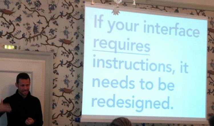
So says Dan: “If your interface requires instructions, it needs to be redesigned.”
#3 Personas can distract from real people
Developing personas is a well intentioned exercise to help you get to know the customer you are designing for. But don’t let them replace actual customers. Dan prefers not to use traditional personas, but instead point to real users by name. Something like “Remember how Mary from last week’s usability testing had trouble with this part of the site – we need to design for Mary!”
#4 The effect of Fit and Finish on usability
Dan referred to “Fit and Finish” as the final polish and small details that product designers put on their products. On a physical product, this could be something like the quality of materials used and a solid construction. In virtual products, he described it as referring to the pixels, alignment, and balance” of your web site or app.
These little details don’t directly affect the functionality of your application, but it does affect how you feel about the application. I really enjoyed how Dan summarized this by saying “If something looks easy to use, and we think it’s easy to use, then it will be easy to use.”
#5 Design for emotion, not features
“Features are only an anchor”, as Dan said. In other words, your punch list of features to build in the app should not be the only basis for your design. Consider how the user will feel about your application and their emotions as they use it. Design the complete experience, and let the features flow from it.
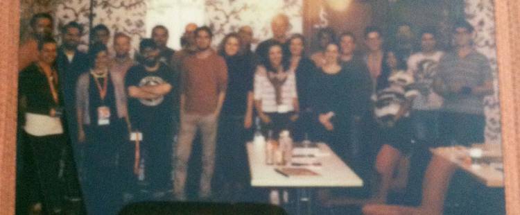
Dan is a big photography nut and has a lot of cameras. He used a classic Polaroid instant camera to take this photo of our class. That’s the first time in 30 years or more I’ve been in a polaroid picture! Dan used the cameras to talk about the feel, interfaces, and emotions that different designs can evoke.
#6 Don’t assume client constraints are fixed
This one was both fascinating and terrifying to me. Dan described how every client will start with a description of what they want, when they want it, and either ask for a price or give you a budget. Dan stressed never to assume that any of those items are fixed, and described a very successful project that took twice as much time and money than originally decided upon.
That is terrifying to me as a manager and service provider, because I know that if the contract is fixed price then I am sunk. And it’s never fun if you have to tell a customer something is going to take longer than expected.
Dan was urging us to look beyond those contracts and what the client asked for, and instead let clients know what is actually possible. Don’t let the original constraints keep you from proposing a grander vision to the client that may re-imagine their product in a better way than they had considered.
If you can sell the client on that grander vision, it will be better for their users and you may find that the client’s original constraints were arbitrary anyways.
The businessman in me still has to qualify this by saying, “tread carefully here.”
#7 “An ugly wireframe is the designer’s vacuum”
Dan is a big believer in UX obviously. But he believes in a very collaborative UX process, similar to what we practice at AgilityFeat with our teams and clients. The UX designer should not spend too much time on the wireframes, or specify too many details. If they do, not only is time potentially wasted, but more importantly, they may stifle the creativity of the designers to propose more visually interesting and useful software.
By intentionally making sure your wireframes are a touch ugly, you remove the expectation from the customer, stakeholders, and the designer that this is the final version of the interaction design.
Now go be a Product Designer
Dan’s workshop was great, and I have even more takeaways from it but this is a good place to stop for now. It was interesting to see the variety of project roles in our room. Managers, developers, designers, UX, a professor, and an architect. UX is an important topic, and it was reflected by this variety of people all trying to learn more about it.
But I liked Dan’s message that ultimately we are all “Product Designers.” Forget about all the other titles, and follow these suggestions from Dan Rubin to become a better product designer. And if you ever have a chance to attend one of his workshops, you should definitely sign up.