The Internet of Things, Big Data, real time communications and messaging. It conjures up images of complicated data dashboards with lots of running charts, streaming data, blinking lights, machines that go “ping”, and just for fun maybe a live stream of trending Twitter topics.
These words conjure up information overload and visually complex applications. But it shouldn’t be this way.
This week I was in San Francisco at the HTML5Developers Conference, which I always find inspiring. In parallel tracks to this at the Moscone Center was also the Internet of Things Conference, and so a common theme to both conferences was real time development in a number of forms: wearables, iBeacons, WebRTC, Internet of Things, and all things Node.js and Javascript.
One of the best sessions I attended was “Re-orientating- UX Desing for the Internet of Things.” Alfred Lui of Seer Labs made a number of interesting points, but this quote of his sums up the talk best for me.
Attention is a scarce commodity these days. Your users are only glancing at the phone or browsing the internet for a few minutes before they do something else in the real world (like keep driving!) or before they move on to another application.
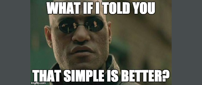
Instead, if you have real time information to radiate out to users, the best way to do it is using “Ambient” methods instead of Push or Pull. The examples Alfred gave involved things like radiating color from a device that indicates the state of the data (red for bad, green for good perhaps). If that color interests you, then you can go to the device and get more details from it. But you get the most important information you need, the high level status, from just a glance at the color.
This means you can’t and shouldn’t just throw all the data you have up on the screen. The challenge for us as a developers and designers is to understand what few bits of data the user cares about most, and display only those initially unless the user asks for more.
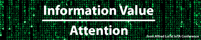
Alfred described this with a ratio … you should try to maximize the value of the information you are providing, while requiring as little attention from the user as possible.
You can always give them more information on request. Alfred described an example of a weather monitor that only shows you the temperature ambiently, but when you step up to it shows you more details about today’s weather. When you tap it, then you see the 5 day forecast.
Perhaps this same principle should apply with data dashboards too? Show a couple of key performance indicators at first, and then allow the user to see more data if they somehow indicate interest. Interest is probably created by clicking, but maybe there are more creative ways to do that such as hovering over data, bringing the browser to the foreground, resizing the browser, going into full screen mode, or whatever.
Alfred’s talk stuck with me the rest of the conference, and everywhere I looked I was seeing either ambient data or opportunities to simplify an interface. A presentation on Android Wear talked about how important it is to show minimal information on wearable devices like watches. My colleague Allan’s talk on using Node.js and Raspberry Pi’s had a small glowing circle in the top corner that let him know if the Pi was still connected to the internet or not (a key concern when dealing with conference wifi). And everywhere we walked around San Francisco, Allan was pointing out things that could or should be connected to the Internet of Things.
If we design this new world correctly, it doesn’t have to be overwhelming. It can be simple, elegant, usable, and provide only limited information to the casual glance, but keep available all the power that IoT vendors promise when you make a request for more data.