Yes, you need a responsive web design. Let me tell you why and what are considerations you have to keep in mind.
A New Era Has Already Started
In 2007 Steve Jobs talked about an upcoming “post-PC” era, an era of devices that “aren’t as general purpose, that are really more focused on specific functions”. Ladies and gentlemen, we already live in that era.
Last November Digitimes launched a report predicting “global tablet shipments to reach 210 million units in 2013, up 38.3% on year and surpass those of notebook for the first time”.
And let us not forget our friends the smartphones. A recently released report by comScore states that smartphone penetration reached over 50% of all U.S. mobile phones in use during 2012. If you ask mobiThinking they would tell you that there are 1.2 billion mobile web users worldwide. And unlike the desk bound user, the mobile user has a purchase intent. The mobile user seeks actionable info and acts within one hour of mobile search.
Suddenly, our beloved website carefully tuned for a seamless desktop experience is not enough. Suddenly our site looks ugly and unusable by millions or newly bought internet-enabled devices.
Responsive Web Design
We need an approach for building a website that still provides a tuned experience on every device. That’s what we know as Responsive Website Design.
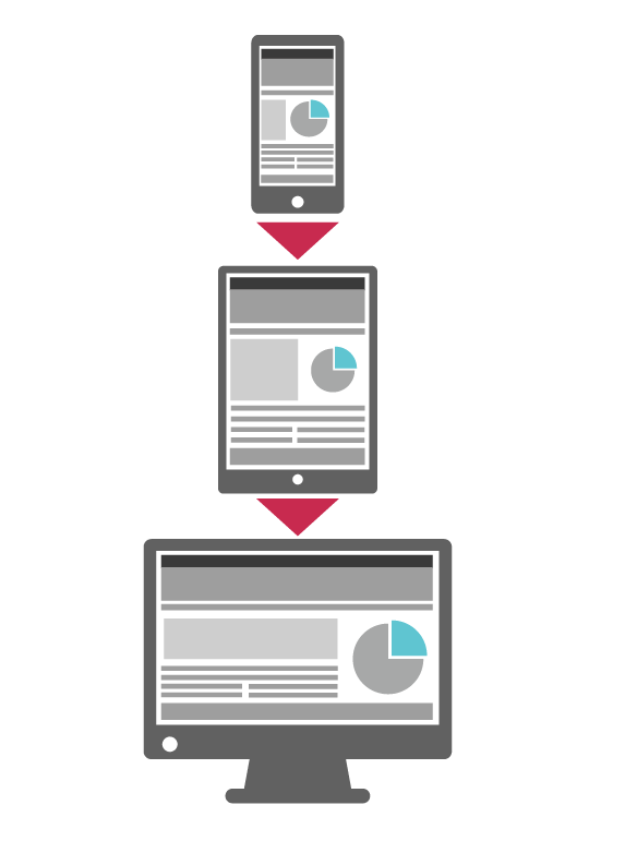
From desktop computer monitors to mobile phones, with Responsive Web Design we aim to provide easy reading and navigation with the minimum resizing, panning, and scrolling possible.
If your website has a responsive web design, its layout is adapted to the viewing environment by using stacked content, fluid, proportion-based grids, flexible images, and CSS3 media queries.
When creating the website we don’t longer ask our clients which resolution we should support. We ask now which resolution ranges we should support. This requires an in-depth knowledge of the browsing behavior of your user base to start considering breakpoints: points where the design should change to prevent look ugly at the current resolution.
Although we have our set of battle-hardened breakpoint definitions that we use to kick-off the User Experience design, we like the approach of just constantly resizing the browser and spotting the resolutions where the site design breaks. So more than discussing which specific breakpoints we should have, we discuss the design and interaction that the site should have at the main sizes we should support.
Mobile-First Responsive Web Design

During our time building with responsive web design in mind for our clients, we have found wisdom in the “mobile-first” part of responsive web design. And I think this became the trend from the moment when Eric Schmidt announced some years ago that Google would start using the mobile-first approach from now on.
Instead of doing graceful degradation from desktop to mobile, we do progressive enhancement from mobile to desktop. This change of direction assures us to start with a UX and content that is lean and impressive. This forces us to create beauty with space and device functionality limitations so adding more shiny things becomes really easy. The opposite is really hard. Trying to trim the fat is always harder than avoiding it in the first place 😉
A Different Development Process
If development without responsive web design was already a creative process by itself, this new responsive era demands a higher degree of creativity and collaboration between all the roles involved in the development process.
In this new responsive web design era, the traditional assembly line simply doesn’t work: The UX designer gets approval for the wire-frames from the client. The UX designer throws the wireframes to the Visual Designer to apply the brand identity and color palette. The Visual Designer throws the visual assets to the developers’ cage. This way of working is obsolete and inefficient for any creative-intensive endeavor.
We’ve found that the best way to put all members of a team together to design, build, test and then evaluate in multiple quick feedback rounds.
This means an intensive Agile facilitation from the leaders, an uncompromised openness from our developers, a higher involvement from our clients and an adamant discipline to deliver quickly and frequently. Deadlines don’t change just because we have our tailored process.
Responsive Web Design vs. Mobile Site
A mobile site is an alternate site that lives along your desktop site. If a user visits a site on their desktop computer, the site actually loads a version of the site that works best for their desktop monitor. If a user visits the same site using a smartphone, the site will ignore the desktop version and will load instead a mobile version of the site, with different html, javascript and assets.
That is not a website that uses a fully fledged responsive web design approach. The main problem this approach has is not being mobile first. We have seen that projects that use this approach have a propensity to multiply the development effort. It is not one website; it is now at least three websites, with duplicated code. Granted, the responsive web design approach is not a free candy, it requires more effort, but not as huge if the right practices and tools are used.
Although the mobile site approach has fallen from grace with the web design community, there are specific cases where it makes a lot of sense for us: if you already have a shiny website and now you want a mobile site without touching or disrupting the site already exists, or your current responsive site is so heavy to load in a limited capacity phone that a mobile optimized site will improve the latency significantly.
The bottom line: Responsive Web Design is now widely considered part of any Web Standard discussion, it is no longer optional. Start by analyzing the distribution of devices used to access your website. That would give you a good starting point to think about going mobile. Drop us an email, we can help you to assess your options.


