 The dust has settled from the World Cup, and I have slowly weaned myself off the TV and back into family and work life. It was a very exciting World Cup to watch this year, and as a fan of underdog teams like the USA and Costa Rica, it was particularly emotional for me.
Building a 2nd screen experience for any live event should help viewers capture that emotion and share it with others. To play around with that concept, I built a simple World Cup screen chat application and used it with friends during a couple of the matches. Here is what I learned about real-time interaction design as both a developer and a user…
#1 It’s hard to type and watch
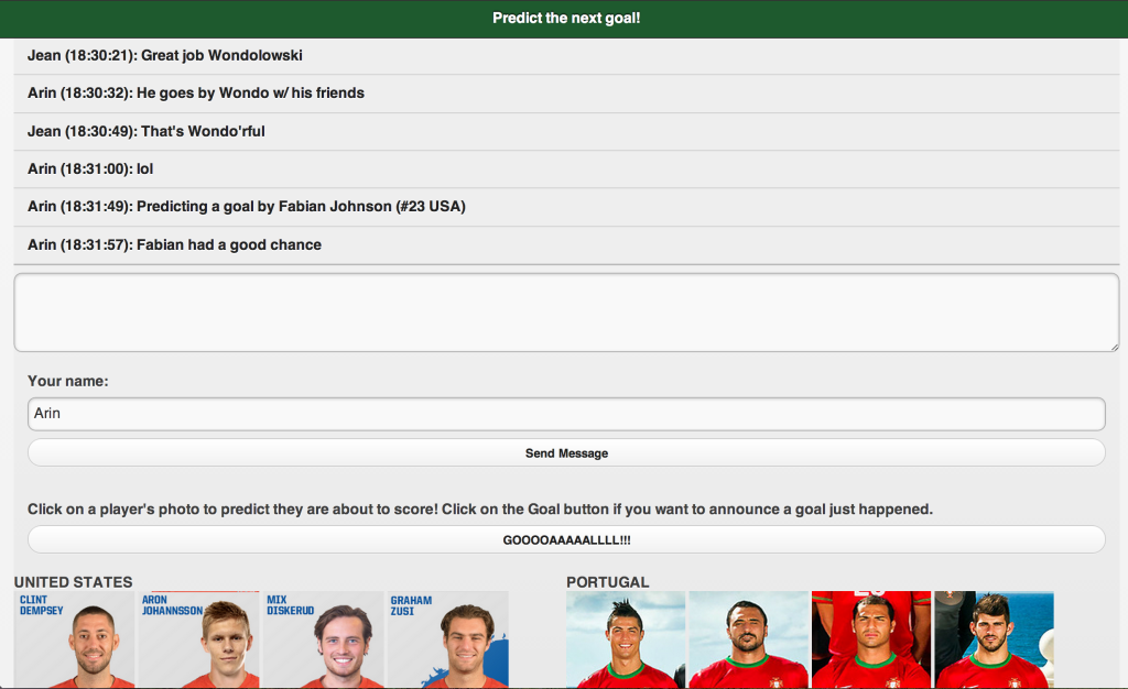
The point of the application I built was to focus users on predicting the next goal to be scored, and by whom. The secondary goal was simply a text-based chat application for users to share the experience with friends.

The problem with a text based application in this scenario is that it’s hard to type your thoughts in real-time. A WebRTC based video or audio chat application would have been better to capture the emotion. I was typing messages from a phone, which is time consuming when you’re also trying to keep up with an intense game.
#2 Time sensitive actions require a simple UI
The main motivation behind this app was to allow fans to predict when a goal is about to be scored. From a technical perspective, this is no problem. I was using PubNub for the messaging backend, which is going to send the messages in less than a second which is plenty fast enough for human consumption.
There is a problem in the UX though – as a fan watching the game, I will often only have a couple seconds from anticipating a goal is about to be scored, to then be the first of my friends in the chat room to predict it. In those brief seconds, I must move my attention from the TV (with some fear of missing the actual goal), to my device, and then press the button to predict a goal.
That means the UI must be super simple. I can take my time to type a message, but that is not fast enough for predicting a goal.
In this app, I originally over complicated it. I wanted users to predict specifically who will score a goal. That meant choosing a player – but choosing a player by their name alone or from a drop down would be too time consuming.
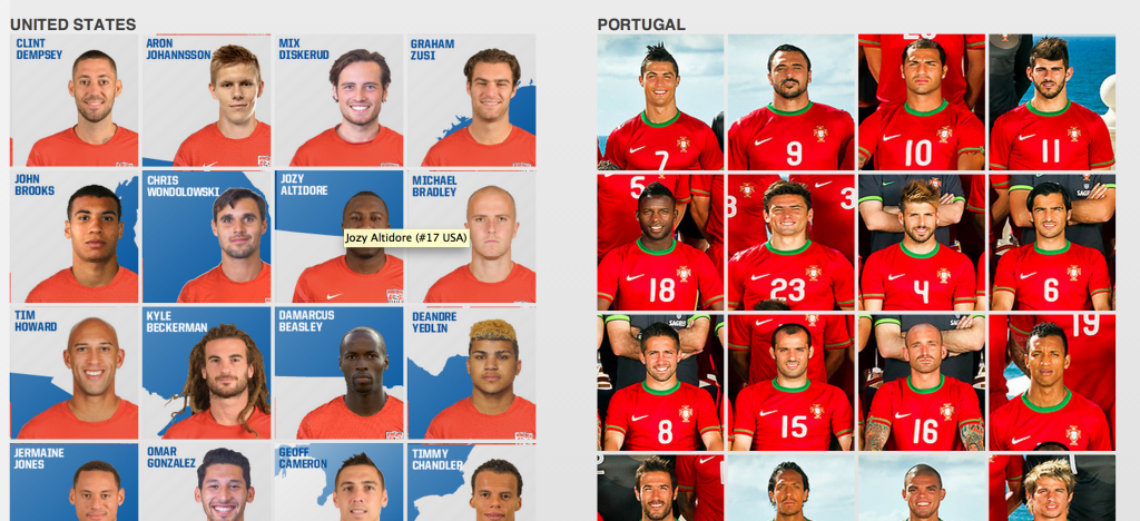
I settled on trying a picture based system where you could pick the player by their face, and with jersey numbers in the picture ideally (though I was somewhat limited by the sample images I found on the internet). My theory was this would be faster, and also easier for those who don’t know all the players by name.
![]()
When you click on a face, it sends a text message to the chat room saying you are predicting that player will score. Nice and fast, no typing necessary, just a click.
The problem with my initial solution was I had all the players for a team visible. This made it hard to scroll down to the right player and find them. In the second game I used the app, I limited the images to only those 11 players on the field at the time, and I also sorted it so that attacking players (those most likely to score) were at the top of the list. Sorry goalkeepers, you got bottom ranking on this view.
This change makes the app more complex (I had to keep track of who was on the field, and in my test app, I was doing that manually and then updating the images), but it was much simpler for the users. But frankly, it still takes a lot of time to pick a specific player who is about to score. It might be better in a future version to allow users to just predict a goal by the team. If you’re gamifying the app, then you just give extra points if they pick the right player who was involved.
#3 The micro-interactions matter
A second screen experience is all about real-time, and as both of the above learnings demonstrate, speed is of the essence. This means all the little details matter a lot.
In the first version of the app I made, after you clicked on a player’s photo to predict their score, you were scrolled back to the top of the chat log. Making the user scroll back down is of course unacceptable, so that needed to change to make the app usable.

Messaging on the buttons should be clear, concise, and fun. I made the “goal” button spell out “Goooaaaallll!!!” like the announcers might shout it out – just to help encourage the emotion of the moment.
#4 Second screen is not for everyone
 Our COO Ford Englander is a passionate fan of all sports. Ford was a good sport and used the NextGoal app with me some, but he had to drop it during the most intense parts of the USA games. For him, it could become a distraction.
That could be improved with better interaction design (for the record, our UX lead Mariana Lopez would probably like you to know she did *not* have a hand in how I laid out this app). But regardless, for some people a second screen social app is just not appealing. Don’t force them into it.
You may want to consider integration with other social media in order to not only bring others into your app, but also to help users interact with friends who were not interested in joining in the second screen experience itself.
For example, in this NextGoal app, it could be cool to allow a goal prediction to also be posted to Facebook or Twitter automatically. Or if I “won” the prediction of an actual goal, then I should be given an option to share that and brag to others outside the application.
Keep in mind though, that interaction with those other platforms must be seamless during time critical actions. It’s a bad idea to ask users to to preview and edit a tweet in order to complete making a prediction. Remember, that goal is about to be scored and I don’t want to waste any time!
Enhance, not distract
The theme of any second screen experience must be to enhance the experience of the primary content, not distract from it. That’s why it’s referred to as your second screen!


